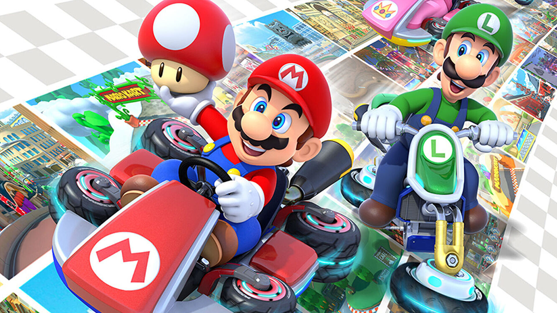
Mario Kart 8 is a stunningly successful game with over 50 million copies sold across Wii U and Switch – so it’s not surprising that Nintendo has returned with a content expansion for its blockbuster kart racer. Dubbed the Booster Course Pass, this expansion includes a whopping 48 courses split over six waves of course releases, with the last drop scheduled for late 2023. So far, 16 courses have been delivered but players and press alike have complained about basic layouts and graphical downgrades. At the heart of the issue is that the bulk of these tracks have been ported from Mario Kart Tour, a mobile game with simplified graphics and gameplay. So how do these new Booster Course tracks stack up – are they a good fit or is the distance from mobile just too large?
While Mario Kart 8 has semi-stylised artwork, cartoonish characters and exaggerated lighting, Nintendo took a slightly different approach with the game’s original race tracks. These feature plenty of texture detail and elaborate buildings, backdrops and interiors. Aiming for high framerates on the original Wii U hardware meant technical concessions, of course, like a heavy reliance on normal mapping to enhance modest polygon counts, but these tracks packed a lot of detail and visual splendour for the player to enjoy. Compared with the new Booster Course tracks ported from mobile, there just isn’t common ground technically between the old tracks and the new.
To start with, the textures look completely different. The Booster Course tracks have flat, low-detail textures in general, particularly on trackside geometry and foliage. The new tracks have a clay-like appearance as a result, with minimal surface detail in most areas. If you get close to certain materials, you’ll notice some grime and roughness has been blended in with overlaid detail textures – textures that contain repeated high-frequency detail. Depending on the lighting conditions, this can look okay, though it doesn’t match the look of the original tracks at all. Most of the time however, objects look almost flat-shaded, which is particularly jarring on grass and other foliage elements. Some of those simpler textures also appear to exhibit some compression artifacts.


